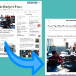
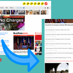
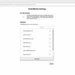
So a lot of websites have started using a pinterest-style grid layout, where there are multiple columns, each with a long list of headlines, all screaming for attention at the same time. It kind of drives me crazy. So I made a chrome extension to always display the mobile version of a page. Most of these sites actually look really nice on a phone. There’s just a single column of content, which is easy to scroll through without losing your sanity. But it can be unpleasant to read everything on a phone. So my extension displays the pages as if they’re on a mobile device, on your normal screen.
Try it out: https://chrome.google.com/webstore/detail/global-mobile/jnphbfhmpdmdhbnjheabpmkmpeeheofp


